
Blu Dot
Tackling small usability issues on Blu Dot’s swatch request increases conversion from product detail pages, and leads to higher purchase intent on high-end designer furniture.
SCOPE
UX Design
A/B Test
E-commerce
THE CHALLENGE
High-intent customers want swatch samples before buying.
Shoppers who order free swatches demonstrate higher intents of converting on major purchases from a high-end furniture stores like Blu Dot. The swatch request modal had several usability issues, including an unclear call to action as users expected the large swatch image to be clickable.
Hypothesis Solution
I believe if we improve the usability and design of the Swatch Request modal window, we will increase add to cart conversion on swatches.
If I am right, then order conversion on swatch requests will increase.
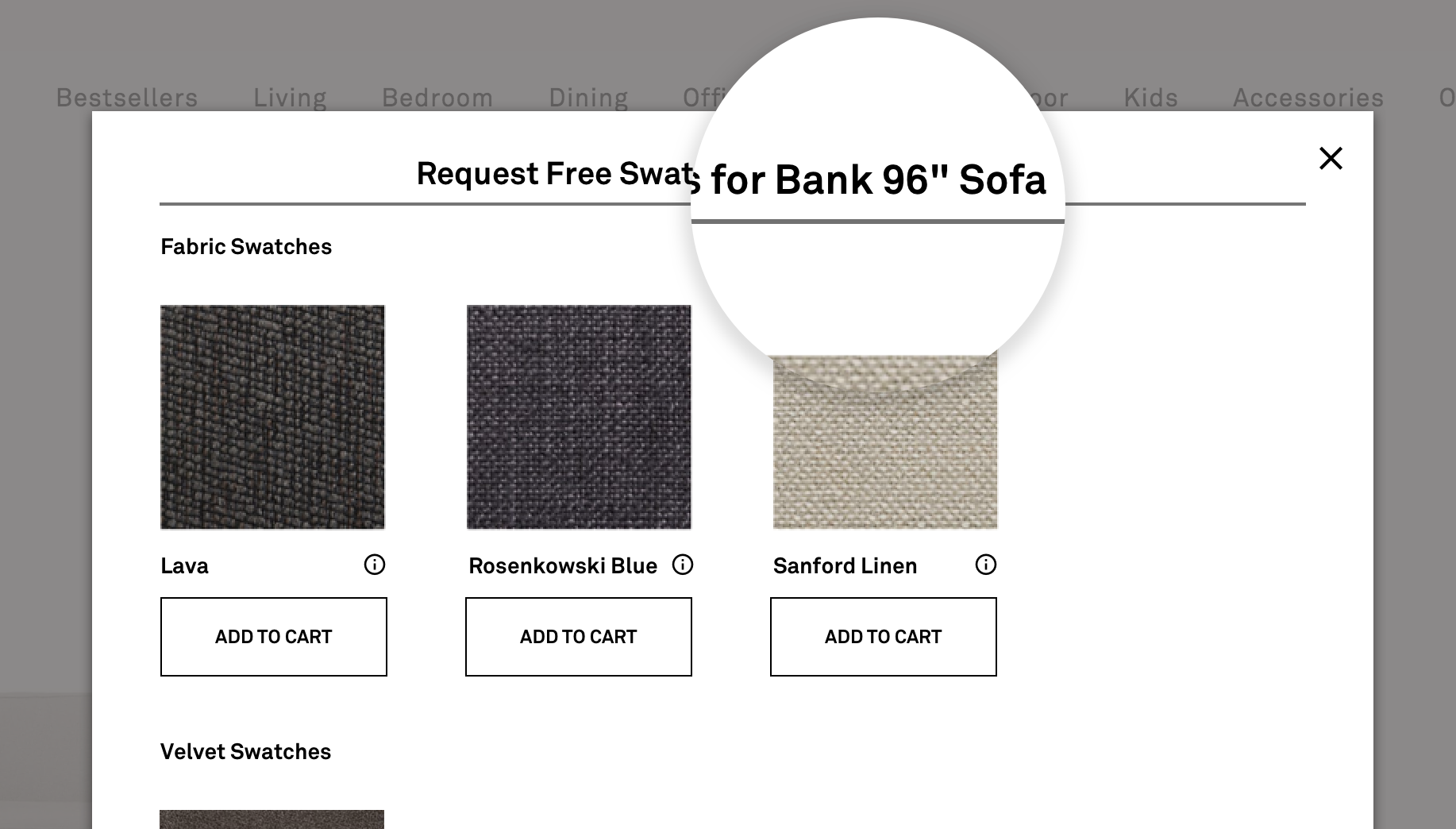
1 — Make the header specific
“Free Swatch Request” was updated to include the product name, and also sticky to the top of the modal.
2 — Make the tooltip useful
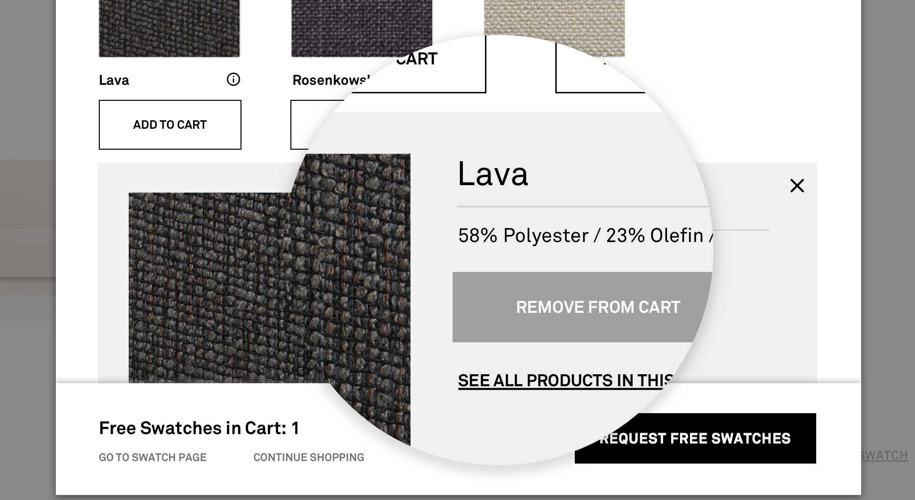
“Add to Cart” icon is converted to a tooltip where shoppers can see a close up of the swatch.
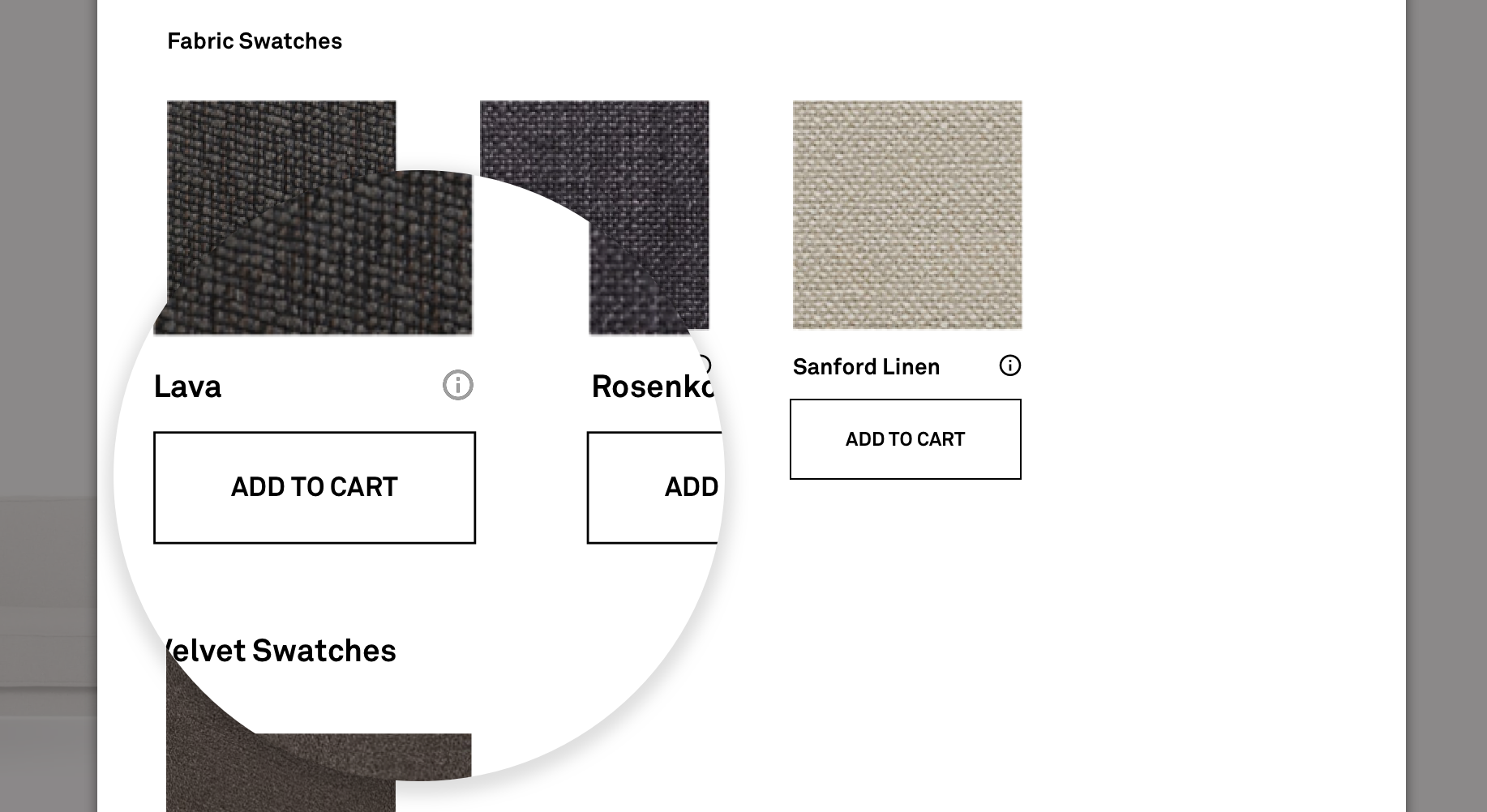
3 — Provide a CTA + Feedback
Call to action below each swatch makes it easy for shoppers to know that a swatch is being added to the cart.
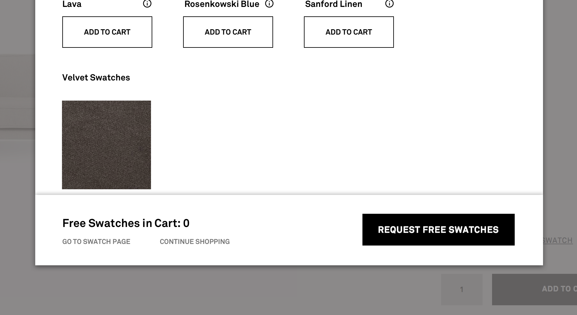
4 — Make the footer sticky
Footer is reorganized with improved visual hierarchy, has a dynamic call to action, and sticks to the bottom of the modal when a swatch has been added.
THE RESULTS
We saw +7.4% increase and lift in swatch requests
The “Add to Cart” button and additional feedback in the sticky footer made it easier for users to navigate through the swatch ordering process.
+17% increase
of visitors clicking the “Request Free Swatches” CTA to advance to checkout.
-39.92% decrease
of users clicking the “Continue Shopping” link and leaving the swatch request flow.
Check out my other work
Silicon Valley Bank • Build.com • Uber • Brooks Brothers • lululemon