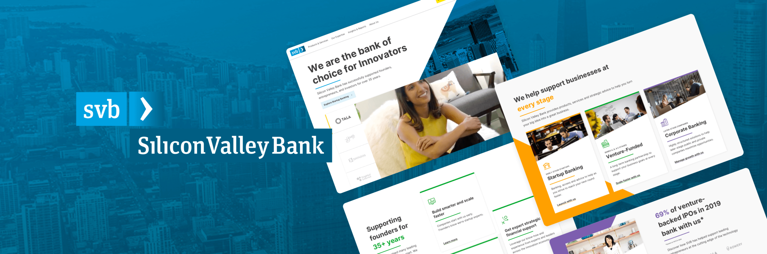
Silicon Valley Bank
A data-driven, home page redesign that communicates SVB’s value propositions and represents the company as the bank of the innovation economy.
SCOPE
UX/UI Design
Visual Design
UX Research
A/B Test
BACKGROUND
With so much foundational work that needed to be done on the website, we spent the first 6 months working with SVB to set goals and identify problems, while optimizing high contact areas such as the navigation’s information architecture and the contact lead form along the way.
After validating and prioritizing the problems, we set our sights towards redesigning the homepage, which received the most traffic. We leveraged problem themes gathered early on from both prospects and clients through user testing, and had also previously developed a new visual design direction for SVB to breathe new life into the homepage.
Problem Definition
Why should a founder or entrepreneur choose Silicon Valley Bank?
The home page doesn’t communicate how and why SVB is the right choice compared to other banks. Ironically, SVB had not updated their visual design in a way that reflected their 35 years of experience as leaders in the tech and innovation space.
Hover to SCROLL ↓
v0: Control
Sub-PROBLEMS
Wayfinding
Prospects are confused about how to find information about products and services relevant to them on the homepage.Brand expression
The headline “Make next happen now” doesn’t quickly inform the user about who SVB is and what they do.How SVB has helped clients is unclear
Client stories don’t necessarily illustrate how they’ve benefitted from SVB’s thought-leadership, products and services.
“It feels pretty traditionally laid out — a little bit cookie cutter, especially if innovation and ‘Making next happen now’ is core to SVB.”
HYPOTHESIS SOLUTION
I believe if we tell SVB’s unique story by stating value, showcasing stats, client logos and quotes, and a faster path to expertise and solutions, prospects will better understand the unique value that SVB provides.
If I am right, we will decrease bounce and increase contact form views.
Design + Validation
Round 1 Designs
For our first round of designs, I attempted to design a homepage that balanced relevant content, fresh and updated visual designs, and interactive, eye-catching modules.
1 — Hero + Statistics
We tested a hero that featured a client photo, and added 4 impactful statistics that demonstrated SVB’s experience.
2 — Business Stages
Module was designed with more relevant content as well as a new interactive element.
3 — Industry Expertise
Industries and the clients supported within each industry demonstrated SVB’s history of supporting other industries besides tech and startups.
4 — Client Logo + Value Prop CTA
Full colored client logos and three additional value props remind prospects of how SVB can support them.
RESEARCH VALIDATION
6 participants were asked a series of questions comparing new design to the control homepage. A balanced comparison ensured that the variation seen first was randomized.
- Stats helped give the bank some credibility and shows off their breadth of expertise, especially their 35 years of helping clients
- Industry module was interesting, but not compelling for most customers at this stage of their discovery.
- Client logos definitely stood out, and many users were impressed by the headline highlighting the 30,000 businesses SVB has helped worldwide.
- Value props in the footer were overlooked, likely due to low placement on the page.
- Video hero was more visually impactful, conveying “togetherness and teamwork”.
- Business stages was also still preferred in the control, as it felt simpler and they could see products at a glance.
- Client photos helped humanize the bank, and effectively showed show how the bank helps different businesses and ideas.
- Global module was needed to help communicate to users that SVB was a global bank, not only based in Silicon Valley.
- Promo module was overlooked by all users tested, demonstrating that new prospects found little value in this content.
“You’re not just giving me logos, you’re actually giving me people. That’s more important. If I knew these companies, I would know they’re doing well. I would think, let me work with SVB.”
Iterate designs + Validate
Round 2 Designs
Based off of our learnings from the research study testing the round 1 designs, we made the following design pivots:
Interactive Client Videos —
Hero was designed to be more interactive and features client logos that tab to different founders.
Cleaner Value Props —
Redesigned the business stage module with interactive cards, and replaced industry module with clear and concise value props.
Impactful Headlines —
Incorporated statistics into module headlines.
Globalization —
Including an interactive globe on the page is not only engaging, but effectively demonstrates SVB as a world bank.
Humanize the Bank —
Designed a carousel to display client photos, testimonials, and logos.
“It feels really clean and you can get more into depth — shows that you are cutting edge. It looks really professional.”
FINAL ROUND
LAUNCH + A/B/C TEST
v0: Control
To make it a fair comparison, we updated the existing Control homepage with color and typography from SVB’s new visual style.
However, we kept the existing UX on the site intact.
Hover to SCROLL ↓
v1: Business Stages First
This variation places the business stages first, using the cascading scrolling layout. The value props are below, in a side-by-side, 3-column layout.
v2: Value Props First
This variation flipped the content order, but kept the layouts. Value props were shown first in the cascading scrolling layout, while the business stages sat below in the 3-column layout.
Results
“Value Props First” variant had the slight edge
Both variations were outperforming the v0: Control. After 45 days of running the test, we paused v1 and let the Control and v2 battle it out.
+11.88% Hero CTA clicks
“Explore Startup Banking” language and prominence above the fold encouraged discovery and drove users further into the funnel of becoming a client.
+12.35% reached business stage pages
Call to actions for each of the business stages were more prominent and drove higher visits to these pages.
+12.72% more clicks to “Sign Up” in footer
While the other metrics were largely unaffected, seeing more clicks at the bottom of the page indicates a significant improvement in scroll depth due to more interesting and relevant content.
Check out my other work
Build.com • Uber • Blu Dot • Brooks Brothers • lululemon