Guideline
401(k) Plan Setup
A sign-up flow that educates prospects and builds confidence that they’ve built the perfect 401(k) plan for their business and employees.
SCOPE
Product design
UX research
Information architecture
Content design
A/B test
Design systems
business impact
Iteratively redesigned Guideline's 401(k) plan setup sign-up flow, increasing same-day signings by 40% and generating an estimated $1.5M ARR impact.
BACKGROUND
I was the sole designer for Guideline’s Growth team, which was focused on helping SMB owners sign up and onboard onto their 401(k) plans.
In 2022, one of our goals with the 401(k) “plan setup” flow was to guide prospective SMB owners to design their 401(k) plan with little-to-no assistance from a sales representative.
This became a priority as the company anticipated the prospect pool to increase 2x from additional marketing and payroll partnerships, so we needed to ensure plan setup and our sales team could handle this scale.
DESIGN CHALLENGE
How might we help prospects feel more confident when designing a 401(k) plan with Guideline?
Navigating the complexities and financial jargon of a 401(k) plan is difficult, and only 22% of prospects converted without assistance from our sales team.
22% drop-off started with the “plan design” card
30% of drop-off after completing all required fields in plan setup
v0: Control
Hover to SCROLL ↓
PROBLEM Validation
In discovery, I started with problem identification – completing a funnel dropoff analysis, a UX audit, and a customer journey mapping exercise. I identified 5 key problem themes:
1 — 401(k) education
Prospects aren’t sure if their 401(k) options or even another retirement product is right for them.
2 — Price transparency
Prospects and collaborators don’t get transparency regarding their plan and pricing throughout setup.
3 — Expectation setting
Prospects aren’t sure what to expect when they first start and after they’ve gone through plan setup.
4 — User experience
The plan setup workflow is overwhelming, and does not provide prospects with clear paths to success.
HYPOTHESIS SOLUTION
I believe if we build a personalized guided path for users in Plan Setup, then prospects will be able to set up their plan with more confidence.
If I’m right, then we’ll see an increase in % of self-sign completion and a decrease in sales and onboarding inbound.
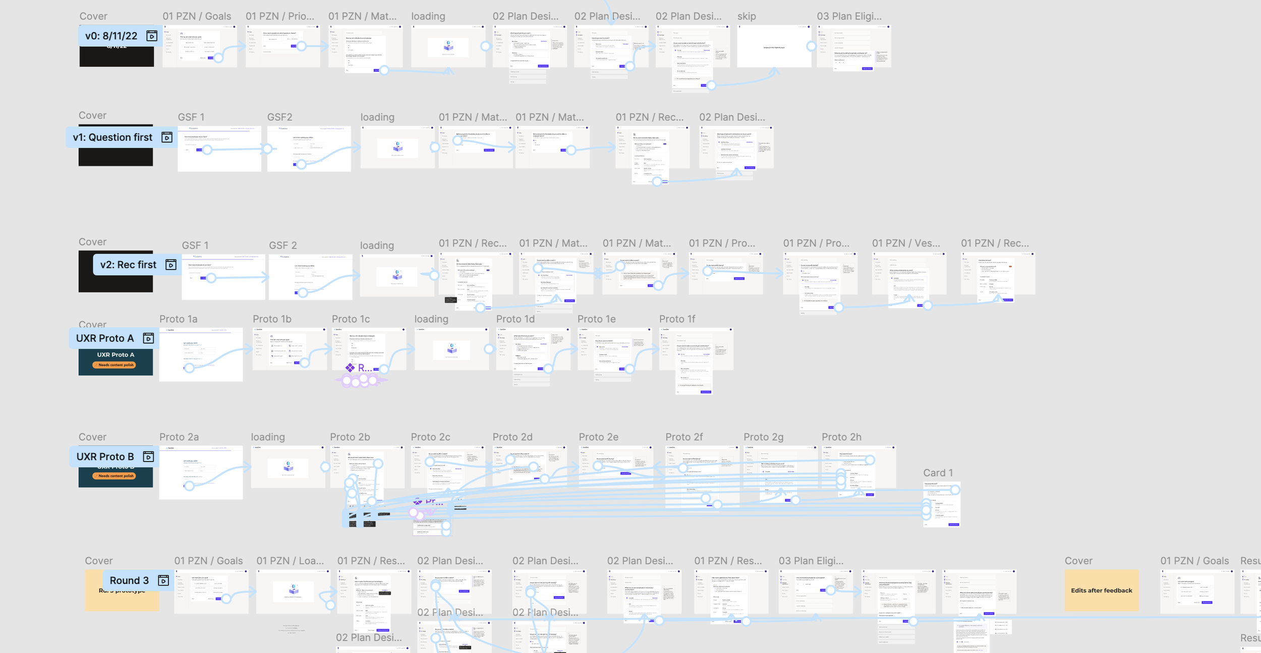
DESIGN + VALIDATION
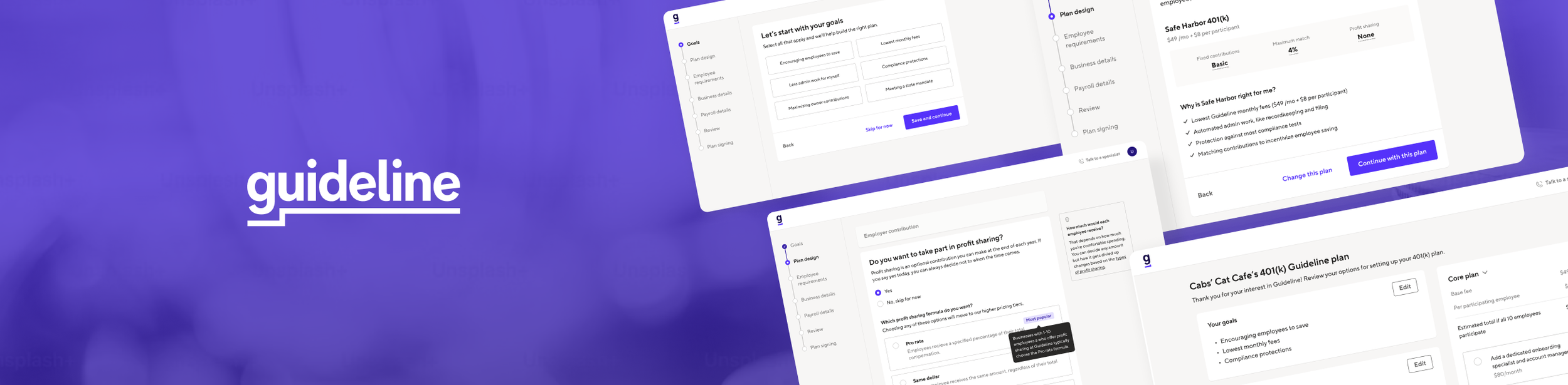
Crafting “personalization” logic
To determine how we made recommendations, I diagramed a flow chart to break down the logic and conditions required. I also collaborated with our legal team and content designer to make each question clear, actionable and easy to understand.
Safe Harbor or Traditional
Safe Harbor plans protect from compliance tests, but require an employer match. Traditional plans don’t require a match, but may be subject to IRS nondiscrimination testing.
Provide a match
Different match types (eg, Safe Harbor Basic, Safe Harbor Enhanced, or Safe Harbor Non-Elective) offer matches based on % of compensation.
Auto-enrollment
If employees don’t opt out of the plan, they’ll automatically be enrolled at a default contribution rate set by the employer.
Profit sharing
This is an optional contribution employers can make at the end of each year.
RESEARCH VALIDATION
With a few prototypes, we wanted to test whether asking prospects about their goals impact their confidence in their plan design choices and/or Guideline's plan recommendations.

Prototype A —
Ask customers about their goals first.
Most users preferred this version, saying that the goals made the experience feel more personalized and guided.
However, they still wanted to better understand the connection between the goals they selected and the "recommendations" given.

Prototype B —
Provide cusomters with a recommendation first.
Users liked seeing the upfront pricing and "why" behind the recommendations. They also felt they were starting with the cheapest plan.
However, showing a recommendation without clear inputs felt less trustworthy.
What we learned —
Asking about goals at the beginning made the recommendations feel more personalized.
- All users said they would still want to explore other options, even when shown a most popular plan.
- Recommended tags gave users a confident starting point, while social proof had no effect decision making.
Path forward
Ask about Goals, and “edit” your recommendations along the way.
Combining the goals-first approach of Prototype A + recommendations of Prototype B, we scoped down the work into multiple phases that allowed us to test and learn while delivering impact quickly.
“I feel like it’s looking for my personal needs. I know it’s just a website, but I feel like it’s listening to me more.”
Phase 1 - A/B Test
Profit sharing question
In the variant, we first explain what profit sharing is, and ask a familiar “Yes/No” question first.
We then educated prospects on the relevant options if they selected “Yes” to profit sharing.
v1: New profit sharing card
Phase 1 results — Winner!
+5.6% completed the profit sharing question, with -73% fewer skips
+13.5% signed same day as plan setup entry, and +9.1% signed within 14 days
+17.3% increase in new self-sign plans ·
-23.4% decrease in Safe Harbor plans with no profit sharing
Estimated Business Impact:
~$1.5M ARR
Projecting across 31k expected prospects in 2023, the change was estimated to add $2.1M in new core plan ARR. We modeled a $568k offset to account for tier shifting — prospects who, better educated, chose lower-cost plans over Safe Harbor — arriving at a conservative net estimate of $1.53M in incremental ARR.
The goal was a number we could defend, not the biggest number we could claim.
Phase 2 - A/B TEST
“Personalizing” Plan Setup
For the next test, we asked prospects about their Goals first and then provided a Recommendation for the plan. To validate this concept, I designed a light solution that integrated into the existing workflow and A/B tested this against the current experience.
v1: Add “Goals” card
Phase 2 results— Winner!
+40% same day signings (3 days post-launch)
+15.2% first day activation v. prior year (30 days after launch)
+11.46% conversion and +5.6% in Safe Harbor adoption (60 days after launch)
Next steps
Deepen the user experience
Phase 2 validated the core hypothesis — that a personalized, goals-first approach meaningfully improved prospect confidence and conversion. With that foundation proven, the roadmap shifted toward deepening the experience across three areas:
Flow UX & Navigation - Replacing the existing nav with a progress bar to set clearer expectations about steps remaining and reduce drop-off from uncertainty about how long setup would take.
Embedded Education - Integrating contextual education directly within each question — reducing the cognitive load of navigating financial jargon in the moment of decision, rather than asking prospects to seek answers elsewhere.
Pricing Transparency - Moving the pricing component to a more prominent position on the plan summary page, addressing one of the original discovery themes (price transparency) that Phase 1 and 2 didn't fully solve.
What I learned
The biggest insight from this project wasn't about the UI — it was about the order of information. Prospects didn't need less complexity; they needed complexity delivered in the right sequence. Asking about goals before showing recommendations reframed the entire experience from "fill out a form" to "design your plan."
If I were to revisit this work, I'd push earlier for a more holistic redesign of the flow UX alongside the personalization work, rather than phasing it separately. The results we saw with relatively contained changes suggested there was even more conversion headroom available with a fuller experience overhaul.