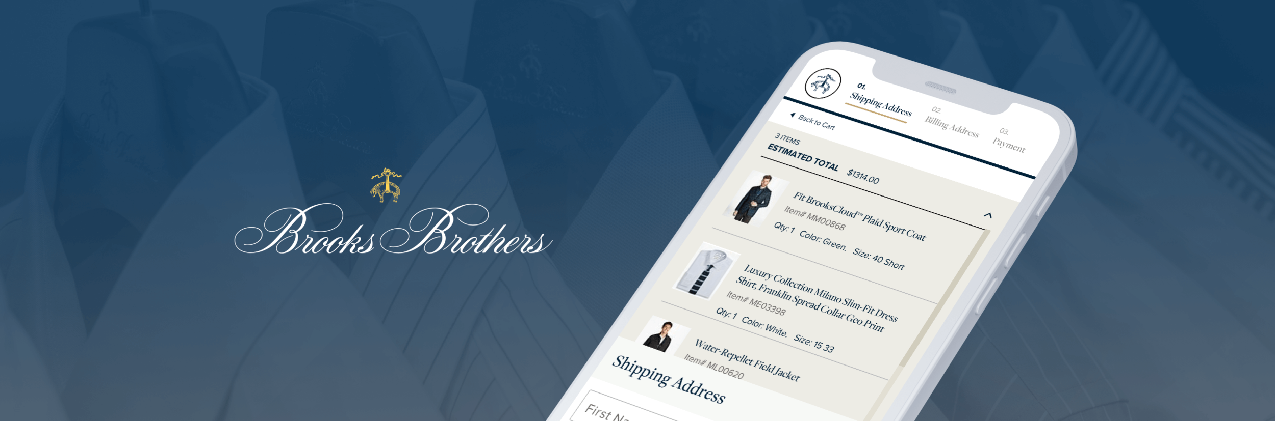
Brooks Brothers
Streamline the checkout flow by guiding visitors with relevant steps, and prioritizing important details like order summary.
Scope:
UX DESIGN
A/B TEST
E-COMMERCE
THE CHALLENGE
The checkout flow is full of distractions that encourage customers to bounce.
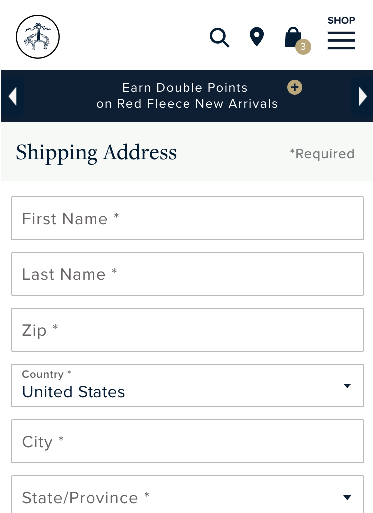
Upon arriving to the checkout page, customers still see the old navigation which include irrelevant call to actions, such as going back to the home page, viewing the entire store menu, searching, and learning about promos.
Hypothesis Solution
I believe that simplifying the navigation and providing helpful, and relevant steps will better guide users through the checkout process.
If I am right, then order conversion rate will increase.
1 — Remove distractions from checkout
Distracting navigation elements like search, locations, cart, and menu icons, were removed to reduce bounce.
The promo banner carousel was also removed to bring the checkout slightly higher on the page.
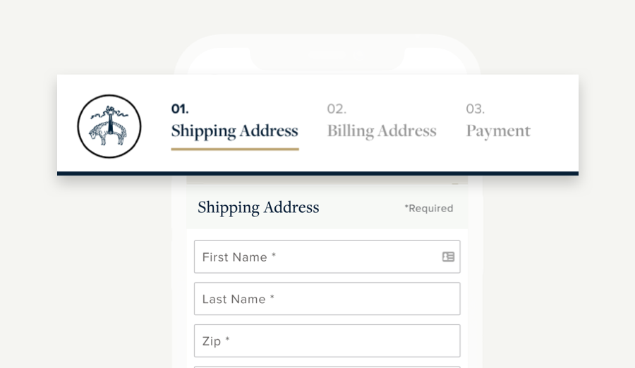
2 — Guide customers with a progress wizard
With extra space in the navigation, I designed a progress wizard to set better expectations for customers on required next steps.
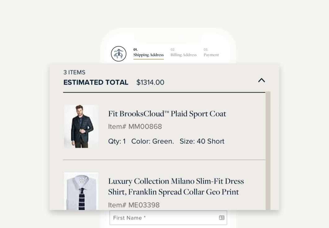
3 — Prioritize the order summary
Giving users an easily accessible order summary at the top of the checkout gives them more confidence in what they are purchasing and reduces return to cart while taking up less real estate lower on the page.
4 — Make the entire navigation sticky
The updated navigation sticks at the top of the mobile screen and follows users as they complete the checkout steps.
The RESULTS
We saw a +1.02% increase and lift in order conversion!
This test ran for 17 days, with the variant seeing overall lifts in visitors moving through the checkout steps, to a +1.02% lift in users placing an order.
+2.04% increase
of visitors progressed to the Payment step
$367,952 estimated revenue lift
over 17 days, based on the average order value x sessions with a completed order
Check out my other work
Silicon Valley Bank • Build.com • Uber • Blu Dot • lululemon