
Uber
Discovering areas of sign up friction and opportunities to design an improved, more guided sign up experience —turning first time Uber prospects into loyal partners.
SCOPE
Cognitive Walkthrough
User Interviews
Customer Journey Map
UX/UI DesigN
BACKGROUND
In 2019, we worked with Uber’s Marketing Experimentation team to optimize their landing pages and increase Driver sign up conversion. While the majority of landing pages we worked on came from paid SEO traffic, Uber also had an organic sign up landing page that received a lot of traffic and was accessible from Uber.com.
In order to prove ourselves as strategic partners for Uber, we were determined to go beyond the landing page and discover opportunities based on the entire Driver signup process. This led to me leading a multi-faceted approach for discovering and validating problems, as well as a potential design solution for prospects on desktop and mobile interfaces.
UX Research
Problem Discovery
Knowing that Uber’s primary goal was to increase Driver sign up conversion, it was important to understand about the problems and user pain points in the Uber driver signup process.
Identify Business Problems
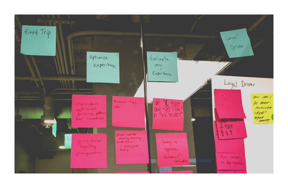
Journey Mapping Workshop
To kick things off , our team led a workshop with Uber product managers participating to map out the existing driver customer journey.
In addition to mapping the phases and stages of the journey, the insights gathered here provided us with problems from a business-perspective.
Validate User interface problems
Cognitive Walkthrough
In a moderated user study, we tasked participants with completing the signup process from Uber's current paid landing page, all the way through the “Bonjour” or onboarding flow beyond the landing page itself.
Participants
6 prospects —
3 desktop + 3 mobile
Goal
Validate areas of friction in the user interface as prospects walk through the signup process.
Hover to SCROLL ↓
v0: Control Landing Page
“I want to see the requirements upfront...
If I don’t qualify, I don’t even want to think about giving my personal information away.”
validate post-sign up problems
Greenlight Hub Interviews
Originally, we attempted to hail Uber rides in Austin and interview Drivers along the way. This proved to be really challenging (and sometimes awkward), since these Drivers didn’t have recent memories of signing up with Uber, or they were more focused on getting us to our destinations.
Pivoting, we decided to partner with Uber’s "experts" at the Greenlight Hub in Austin, Texas, where we could interview recently approved drivers coming through their doors about their sign up experience.
Goal
Validate what motivates pre-first trip Partners to successfully complete the signup process, as well as what pain points were experienced along the way.
Participants
4 new drivers + 1 Uber expert interviewed
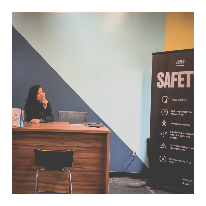
Practicing my interviewing skills at the Uber Greenlight Hub in Austin, Texas
“I don’t think there’s been a point at which I’ve been presented with all of the steps that need to happen... I still don’t know what they really need.”
Problem Themes
Prospects want to drive, but they need a GPS to get there.
After identifying business-perspective problems during the customer journey mapping workshop and validating user problems, we identified three main problem themes with the overall signup process.
Problem Theme 1 —
Expectation Setting
Prospects expect to see more information about the vehicle and document requirements on the landing page before they begin the signup process.
They want to make sure they’re qualified before giving their personal information.
Problem Theme 2 —
Signup Return
Abandoning the signup flow is easy, but returning to the signup process once prospects have started is difficult.
- Session-level users with rider accounts are routed to login, with no clear CTA to return to the signup flow.
- User-level (return) users don’t realize they can login to resume their applications.
Problem Theme 3 —
Unclear Next Steps
At the end of the signup process, prospects ask “Now what?” There aren’t clear next steps that explain if users are stuck or waiting.
- Why are certain documents pending review?
- How long will review and approval take?
- Where do I go to get support?
Experience Journey Map
Scroll for details →

Hypothesis
I believe if we better “guide” prospects who are signing up to drive, they will have clearer expectations about required documents and next steps.
If I am right, then signup starts, completions and “first drives” for first-time drivers will increase.
1 — Accessible CTA
Provide a call to action is accessible at any given point when prospects are ready to start the sign up process.
2 — Guarantee + Value Props
Personalize the guarantee amount based on the prospect’s location.
3 — Transparent Requirements
Inform prospects of what materials they need so they aren’t hit with surprises halfway through the signup funnel.
4 — Signup Form
Bookend the landing page with the call to action again so prospects can sign up.
Mobile Designs
Making it mobile-friendly
Navigation Buttons
Additional navigation buttons make it easy for visitors to view each screen without accidentally scrolling past a page.
Progress Bar
The progress bar is an indicator that informs users of how long the page is.
Carousel Requirements
Requirements are displayed in a carousel to leverage tap and drag interactions that are natural for mobile users.
next Steps
Build the landing page for testing, and continue to iterate.
Build and test.
Although these designs were not tested with Uber, my next step would have been to work with development to build the landing pages, and run these variations against the control experience in an A/B test.
Monitor analytics for lifts and insights.
In the analysis, we would be interested in measuring sign up starts and sign up completions as the primary metrics, as well as engagement with newly introduced elements (such as the Requirements section) as secondary metrics.
Check out my other work
Silicon Valley Bank • Build.com • Blu Dot • Brooks Brothers • lululemon